Mr. Bucket Chocolaterie
Brand Identity, Packaging, Graphic Design
2025






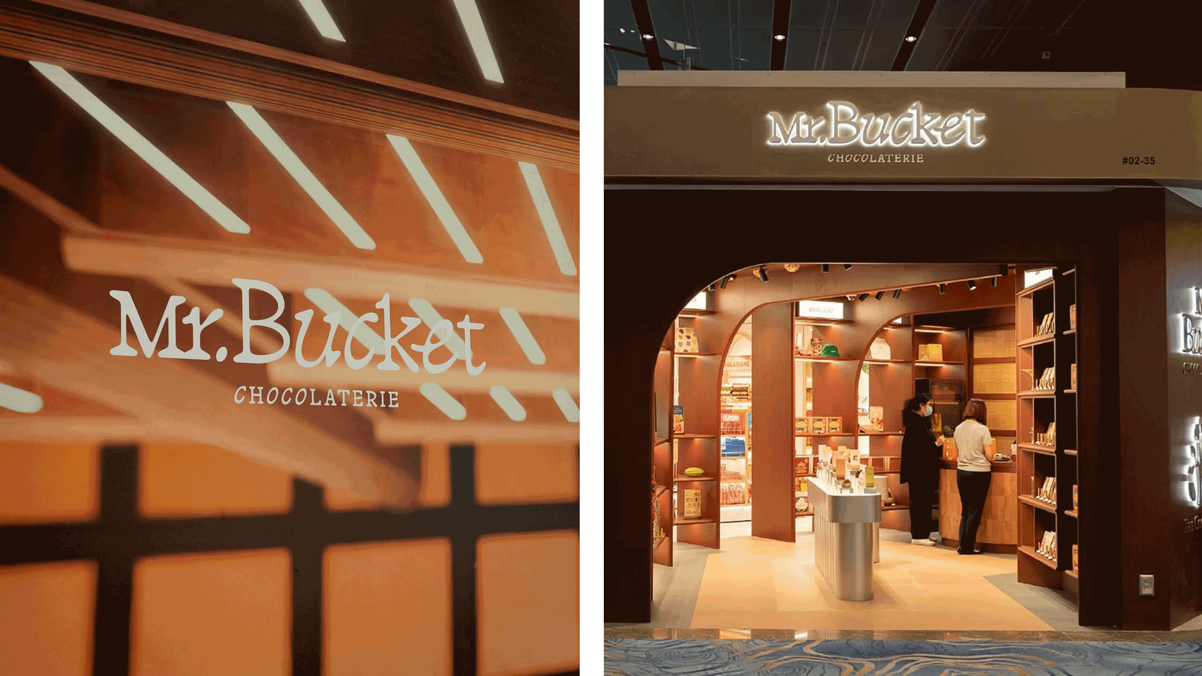
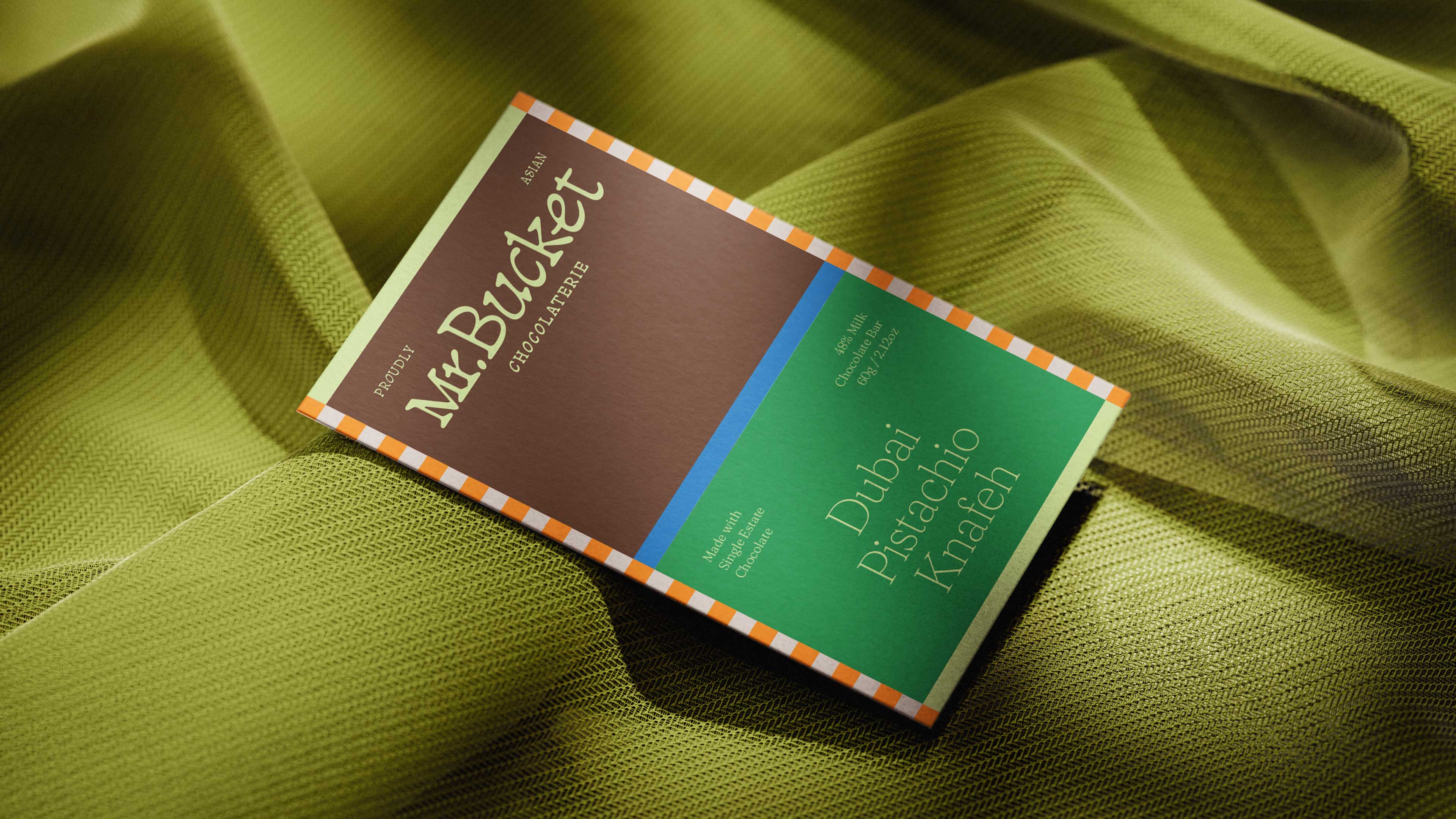
Leading the Way for Asian Chocolate
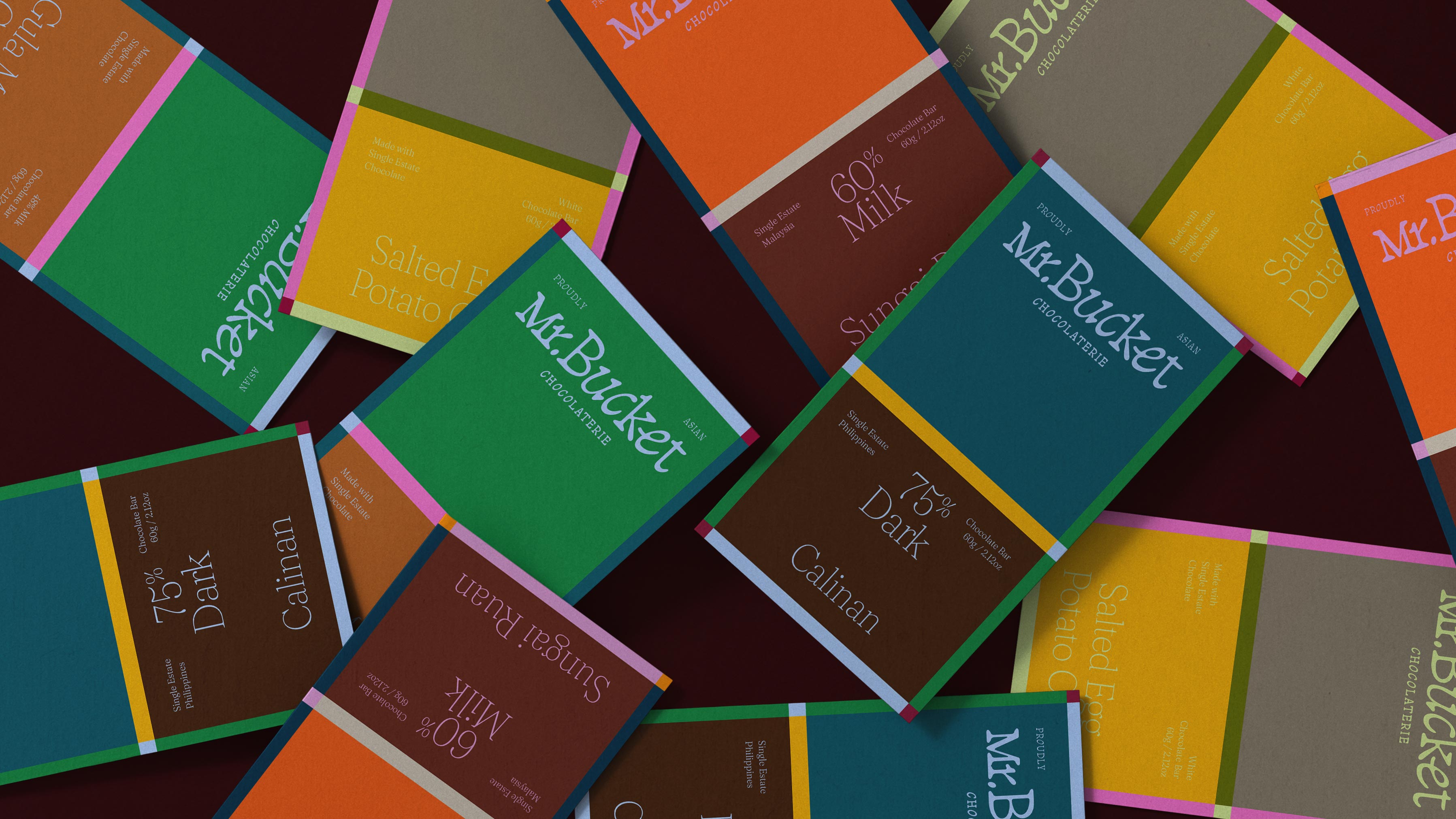
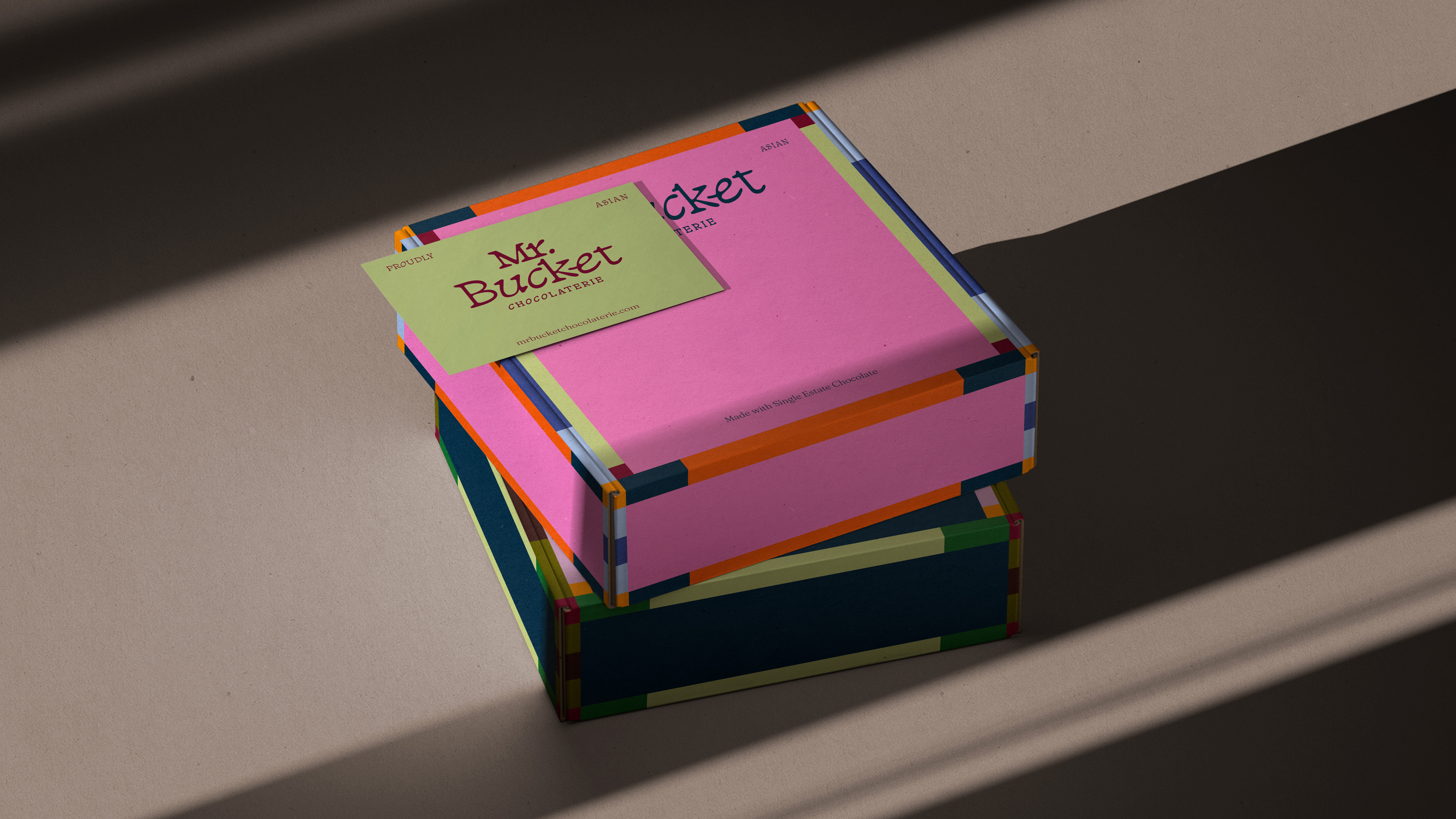
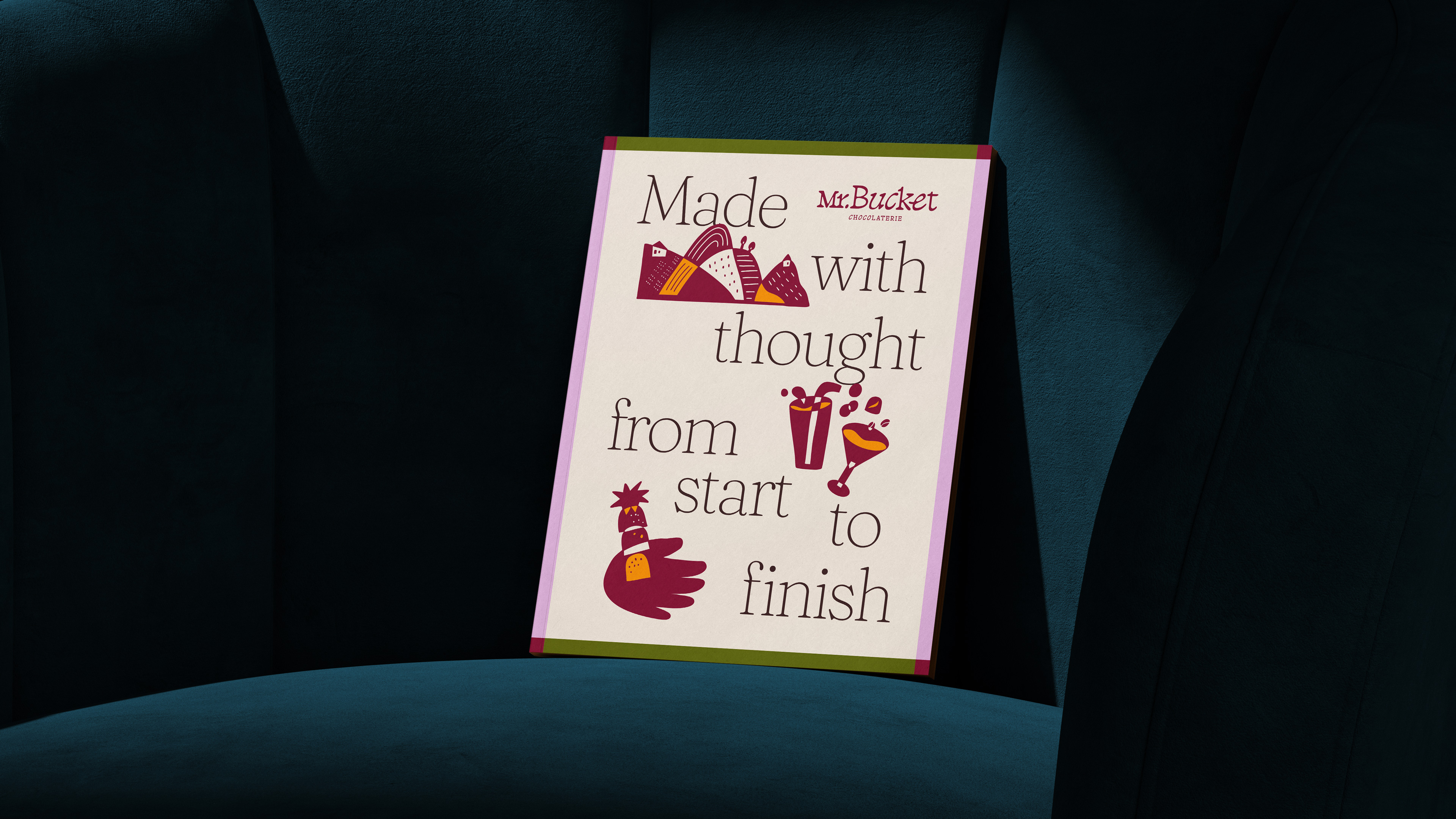
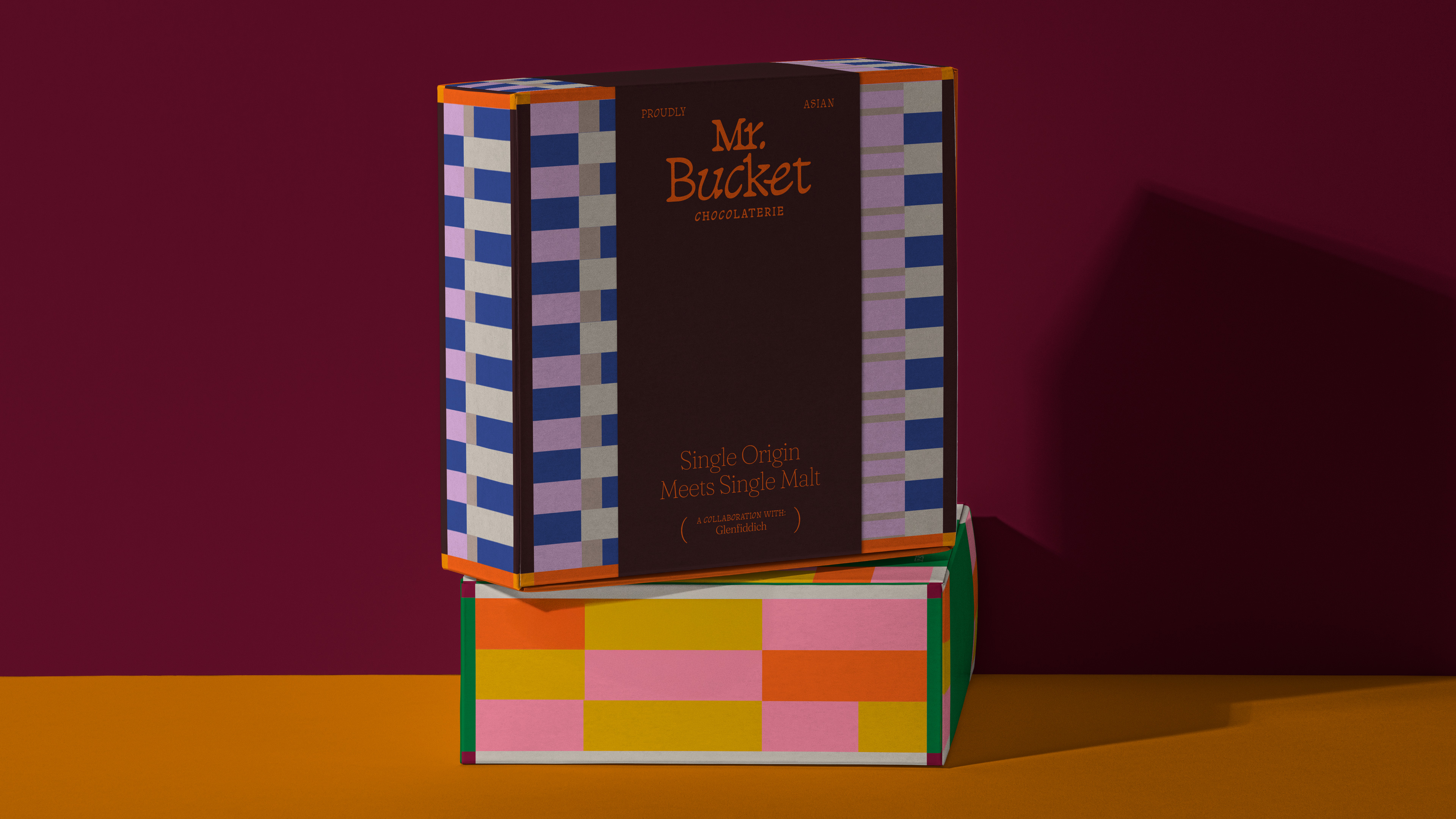
Accessible bean-to-bar chocolate made Mr. Bucket a rising household name. After slowly outgrowing their identity, we partnered with the team for a refresh that could keep pace with their ambition.
The challenge: convey Mr. Bucket’s inventive and genuine spirit, while giving it the weight and polish matching its high quality, handmade craft.
Designing with Mr Bucket’s customers in mind, we created the brand’s full suite of packaging to feel almost collectible: nice enough to display in one’s home in full sight. As a champion for quality Asian chocolate, every choice was made to set a new standard for artisanal chocolate packaging in this highly competitive segment.
Featured on The Dieline.
TEAM
︎︎︎ Creatives: Dan
︎︎︎ Project Manager: Kimberly
︎︎︎ Project Director: Yong
︎︎︎ Completed at: Somewhere Else
Seek Sophie
Brand Identity, UI Design, Illustration
2024

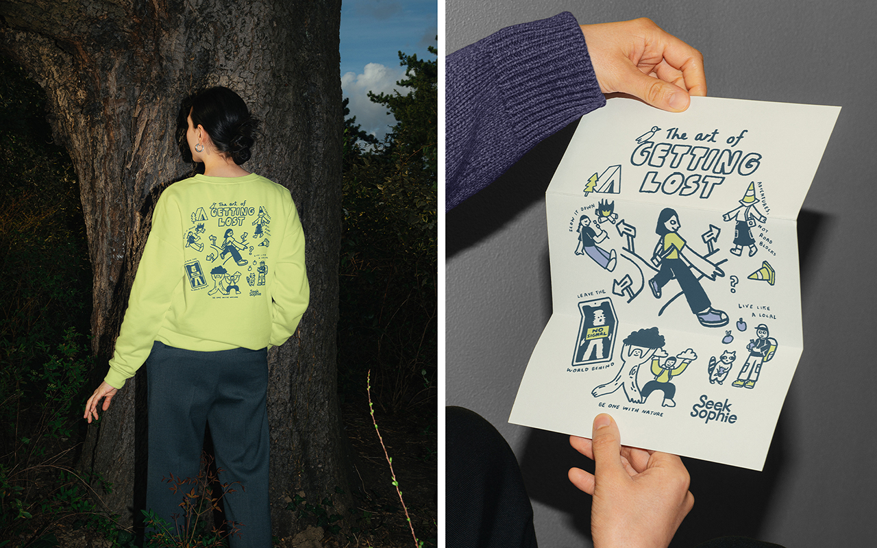

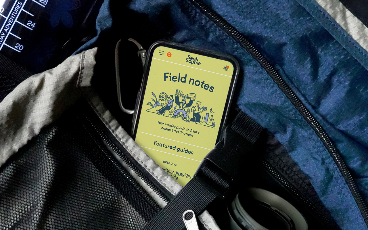
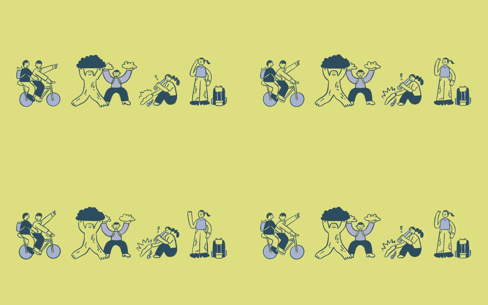
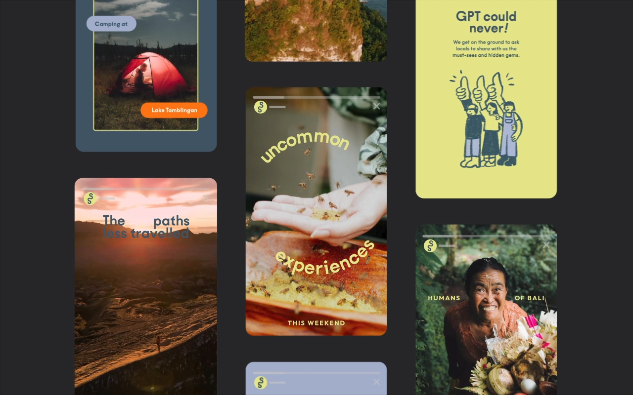

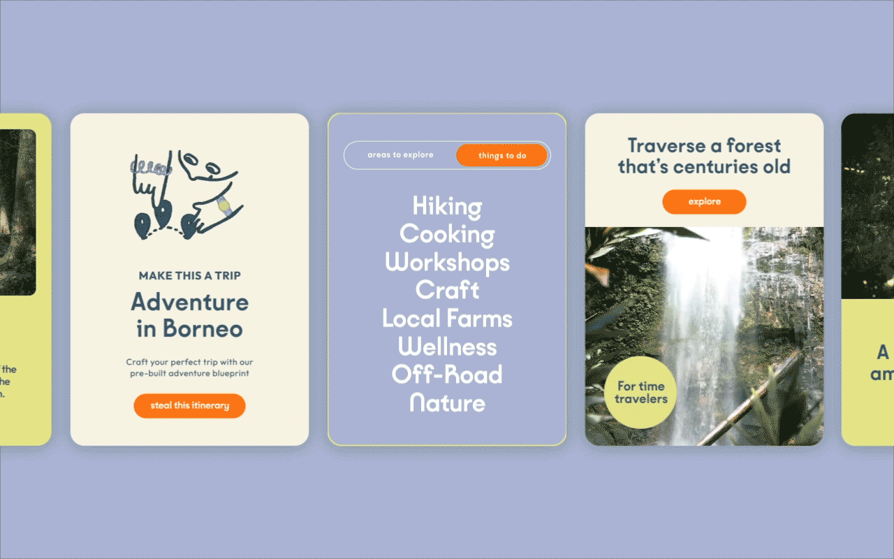
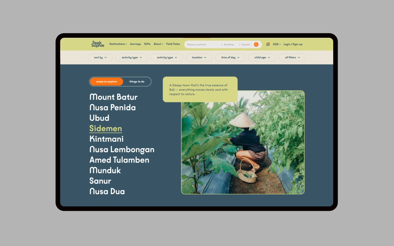


Once Misunderstood, Now Unmistakable
A travel experience company offering alternative ways to explore SEA, Seek Sophie encourages people to venture out of their comfort zones, to find deeper meaning for themselves.
Leveraging on Seek Sophie’s unparalleled ability to offer rich, localised experiences across the region, we sought to help them settle into their renewed position as a force that’s encouraging people to embrace a different form of travel, far and away from the expected travel packages.
By working very closely and collaboratively with the Seek Sophie team, we developed this energetic brand identity that truly reflects the spirit of Seek Sophie and their mission and purpose that travel should be a force for good.
Check out their website here.
TEAM
︎︎︎ Creatives, Illustration: Dan
︎︎︎ Brand Strategy: Alina Phang
︎︎︎ Project Director: Yong
︎︎︎ Completed at: Somewhere Else
Oatbedient
Brand Identity, Illustration, Packaging
2022 – 2023
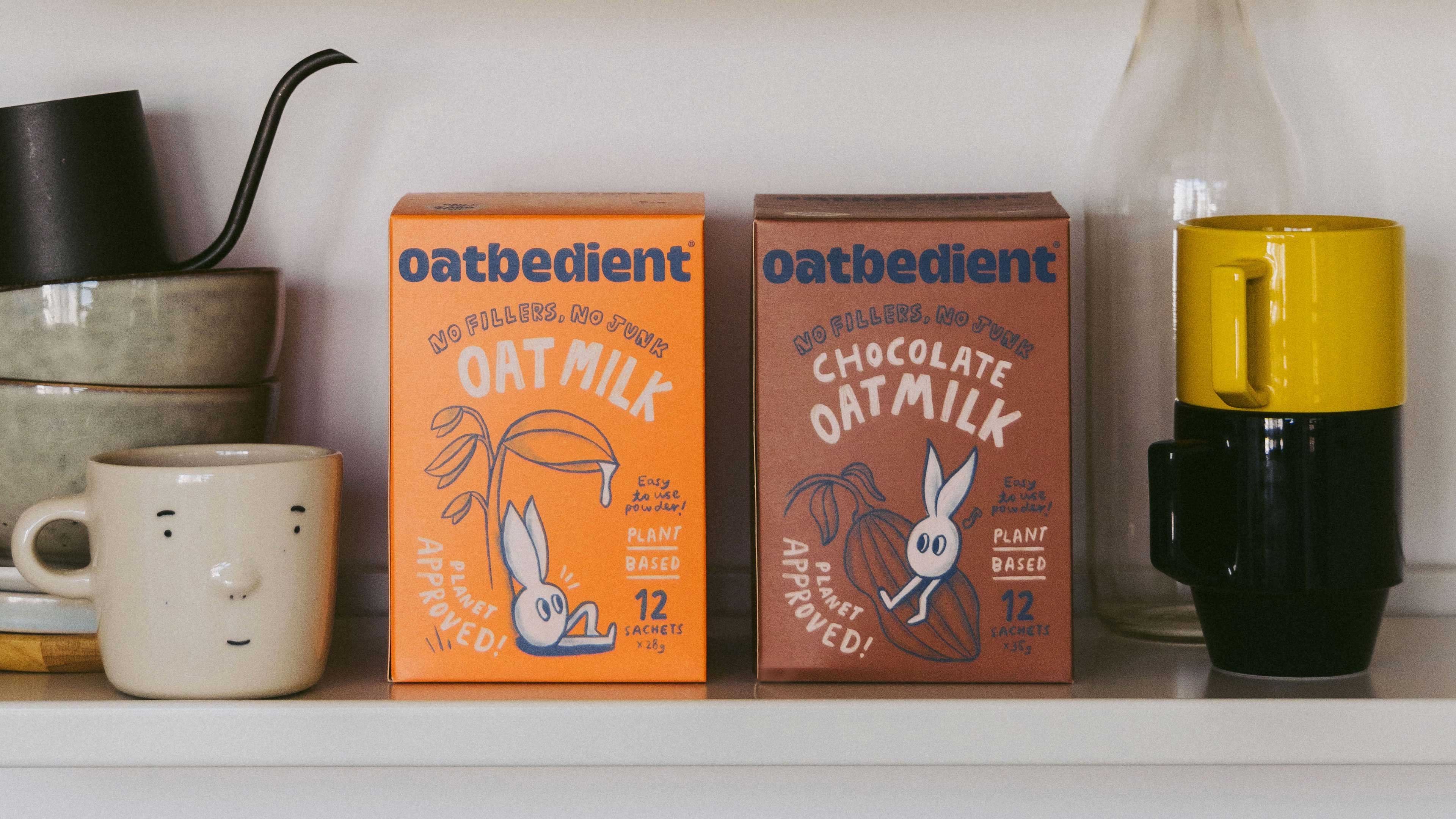

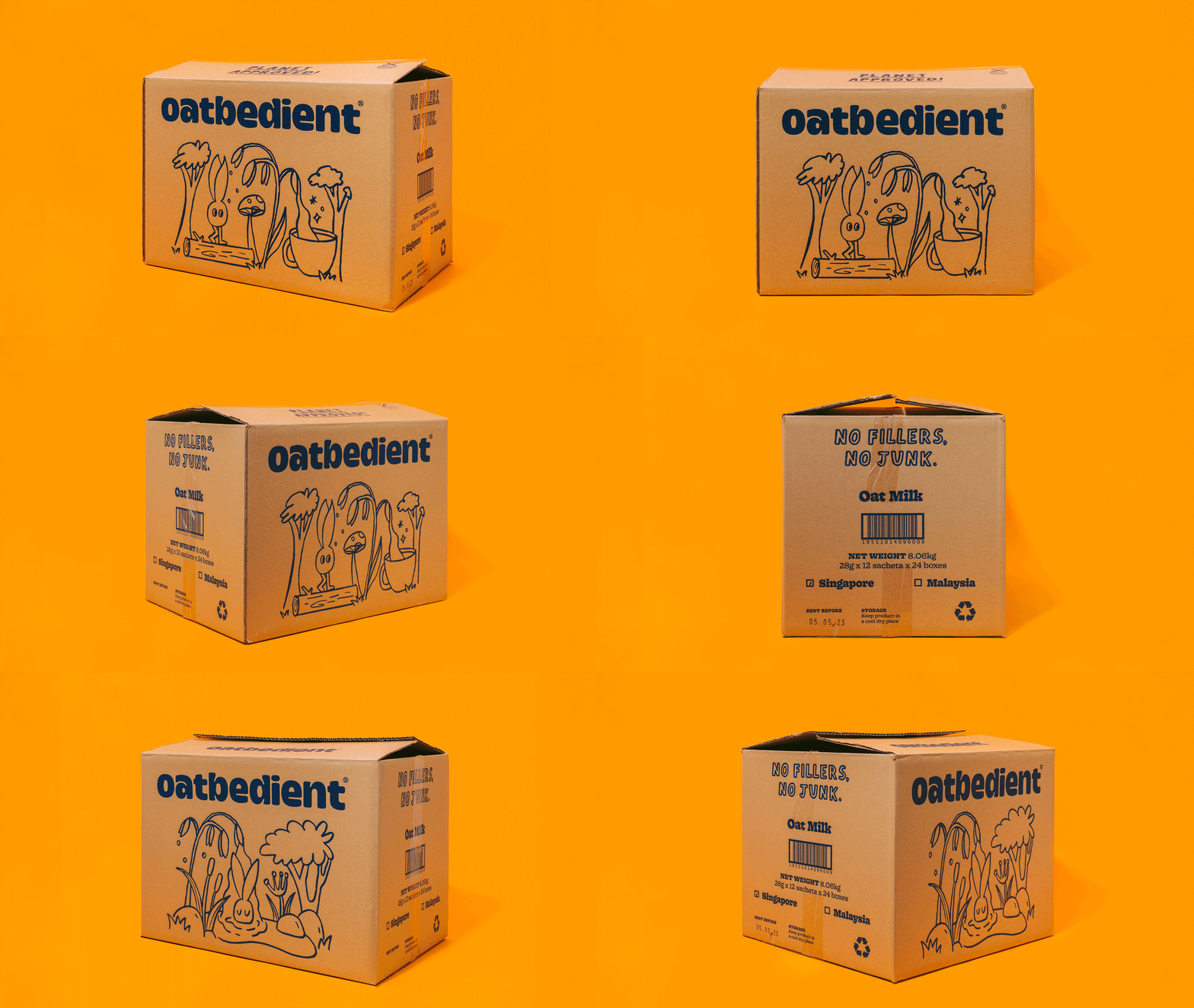
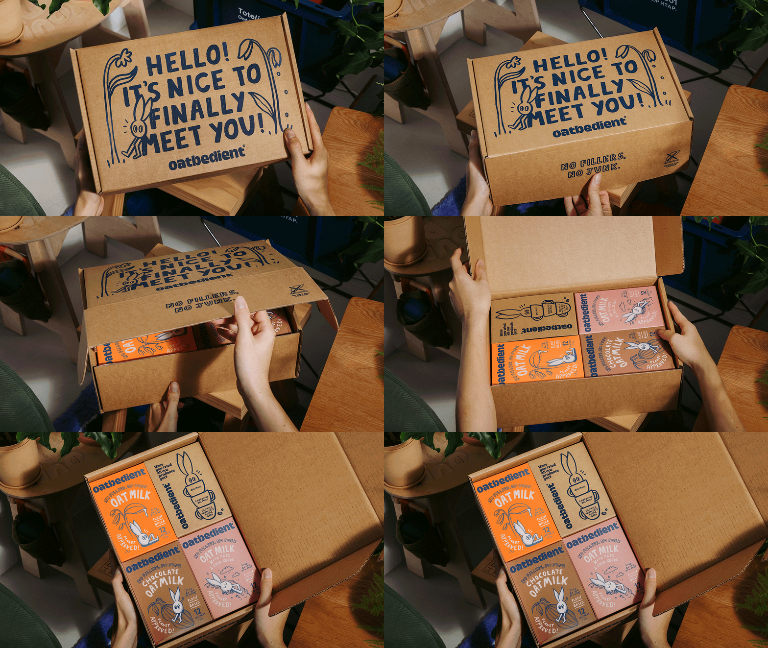
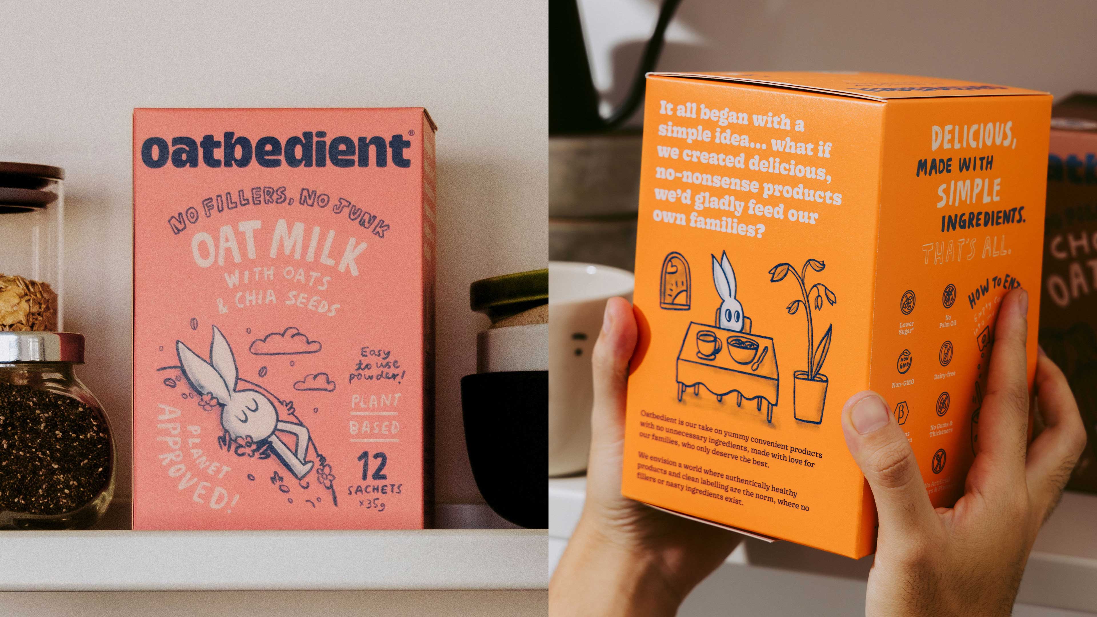


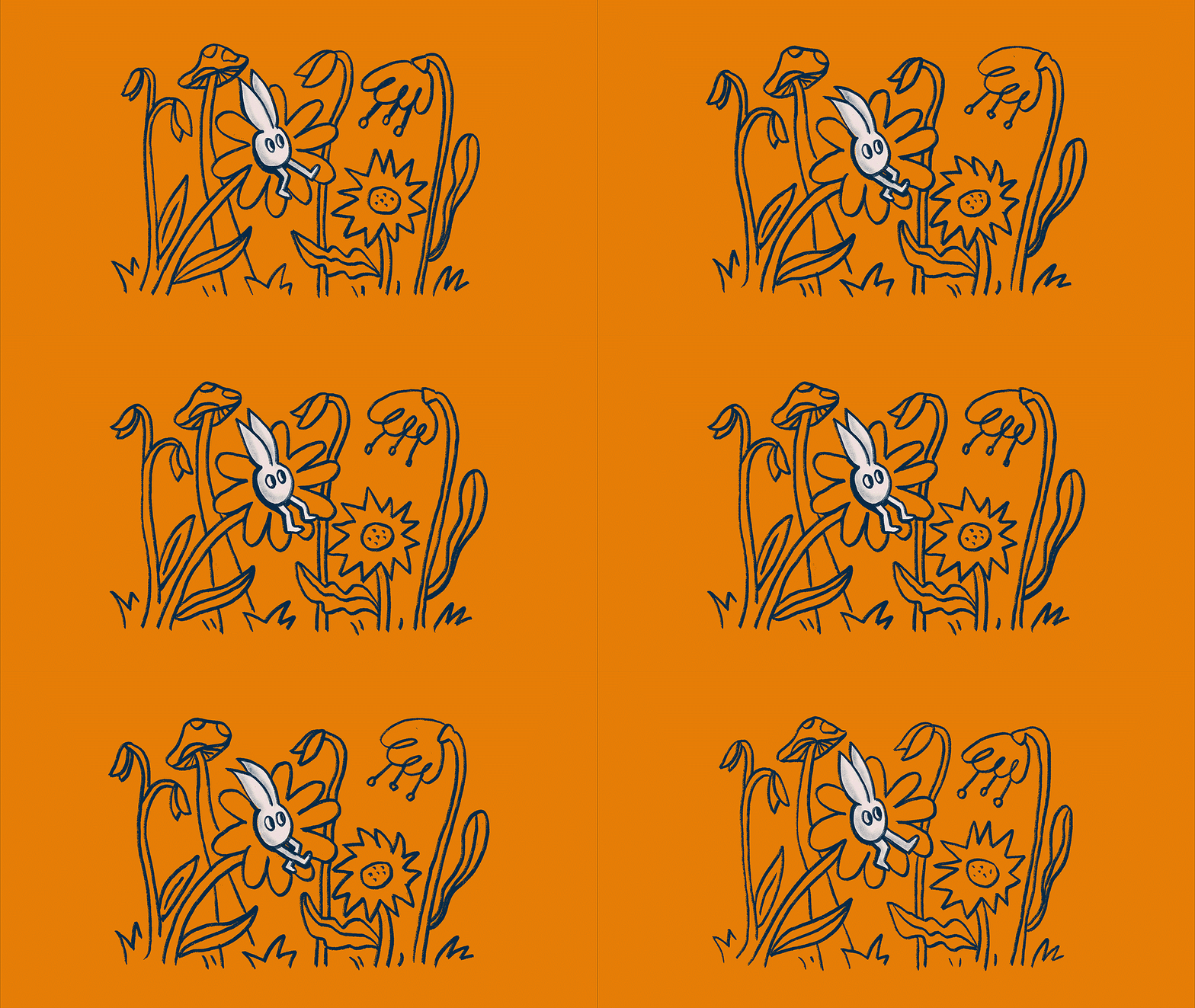
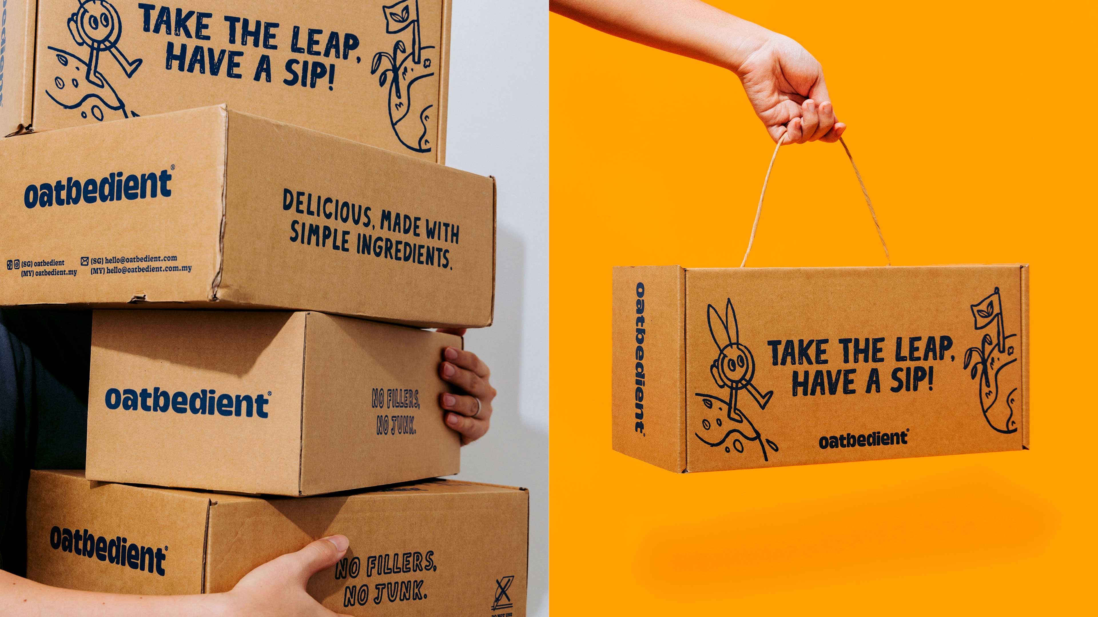


Taking on Big Goals with a Humble Identity
For people looking for dairy-free alternatives, Oatbedient is an oat-centric brand that is delicious, easily accessible and puts clean labelling at the forefront.
By working closely and collaboratively with the Oatbedient founders; we arrived at a refreshing, delightful and heartwarming brand identity that stands out because of its universal appeal.
Big brands don't have to lose their humanity. We knew we wanted to help build one that's the antithesis of cold mega-conglomerates that dominate the food industry.
Taking a personable approach that aligns with this promise —creating Oatdit, a humble oat grain character whose wide-eyed view of the world is simple and blissful—accompanying you on your everyday adventures as it explores and enjoys the best that nature has to offer.
Check out their website here.
TEAM
︎︎︎ Creatives, Illustration: Dan
︎︎︎ Brand Strategy: Alina Phang, Kitty Vo
︎︎︎ Account Management: Jeanette Goh, Kimberly Pang
︎︎︎ Project Director: Yong
︎︎︎ Completed at: Somewhere Else
Anticipate Pictures
Social Media, Graphic Design for Film
2017 - 2025

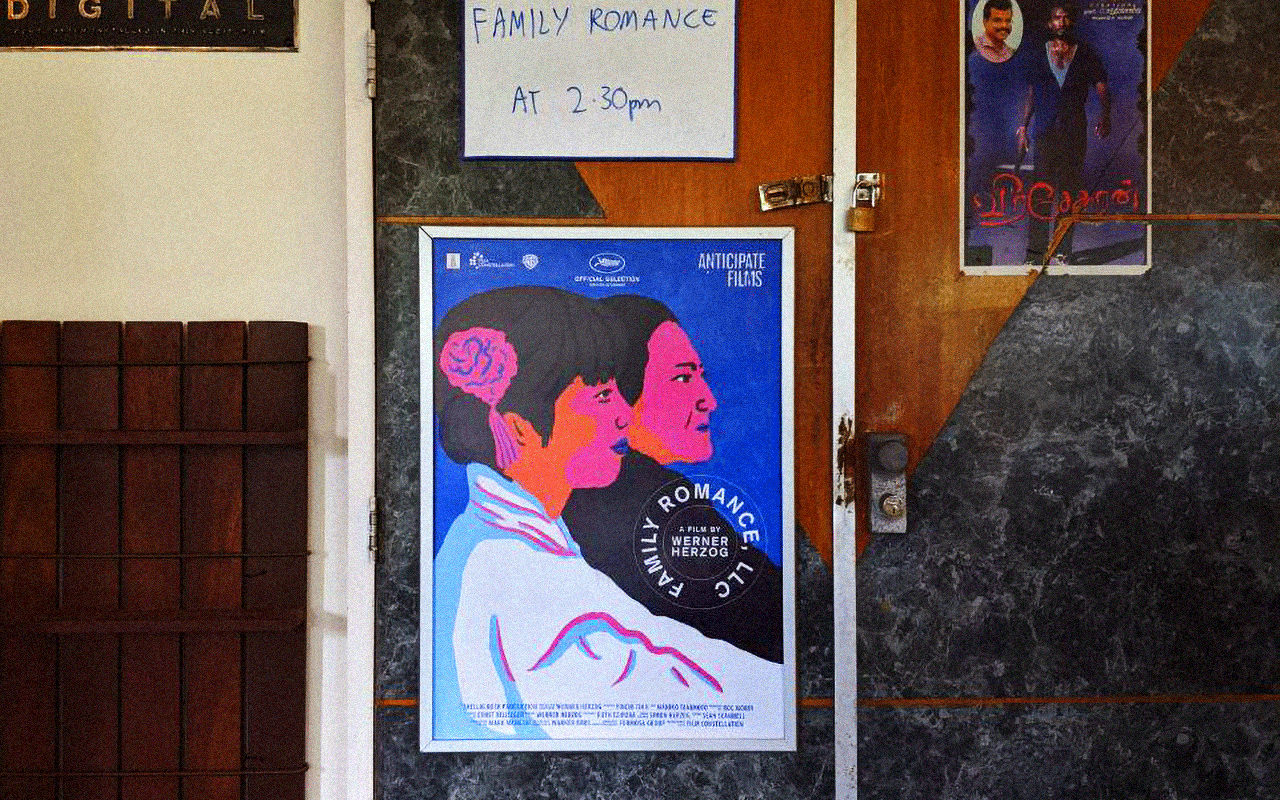


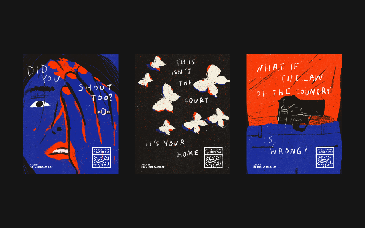
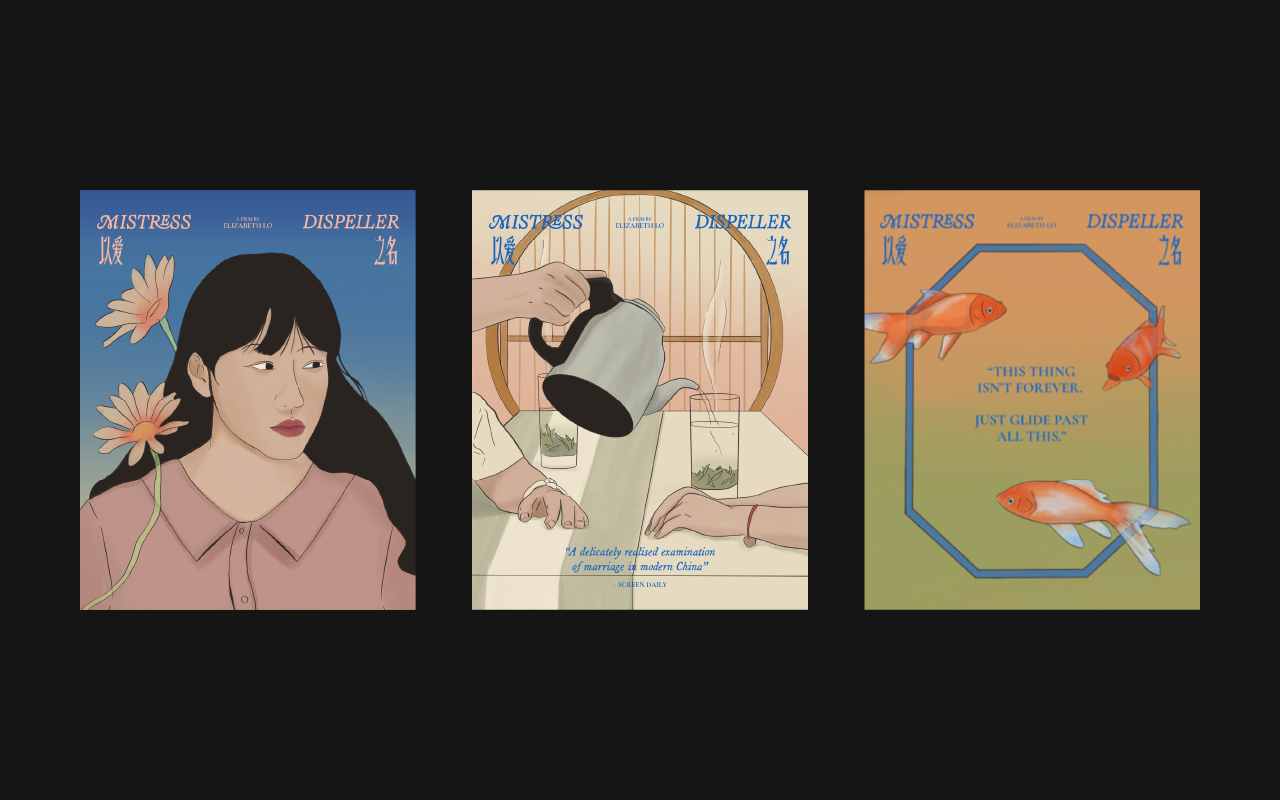

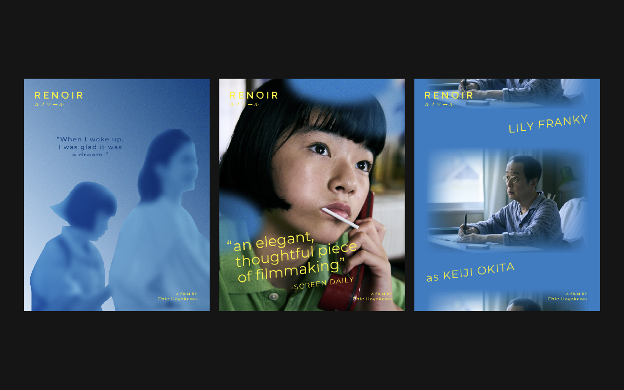

Bringing the world closer through film
Anticipate Pictures is a Singapore film distribution company seeking to make a difference — with a focus on exciting independent films, cutting edge arthouse cinema, and the most revealing documentaries from around the globe.
With a belief that local audiences deserve to see award-winning films that are not just enjoyable but thought-provoking, over the years, Anticipate has brought a score of amazing films to Singapore, screening them at The Projector, Oldham Theatre, The Arthouse, SGIFF and other independent cinemas.
For the past 7 years, I’ve been working with Anticipate Pictures as the creative lead, re-interpreting the beauty of each film in graphic form.
TEAM
︎︎︎ Creatives: Dan
︎︎︎ Anticipate Founder: Vincent Quek
︎︎︎ Marketing Manager: Tiffany Nah / Dan Koh
Eat Snake
Graphics, Illustration
2023
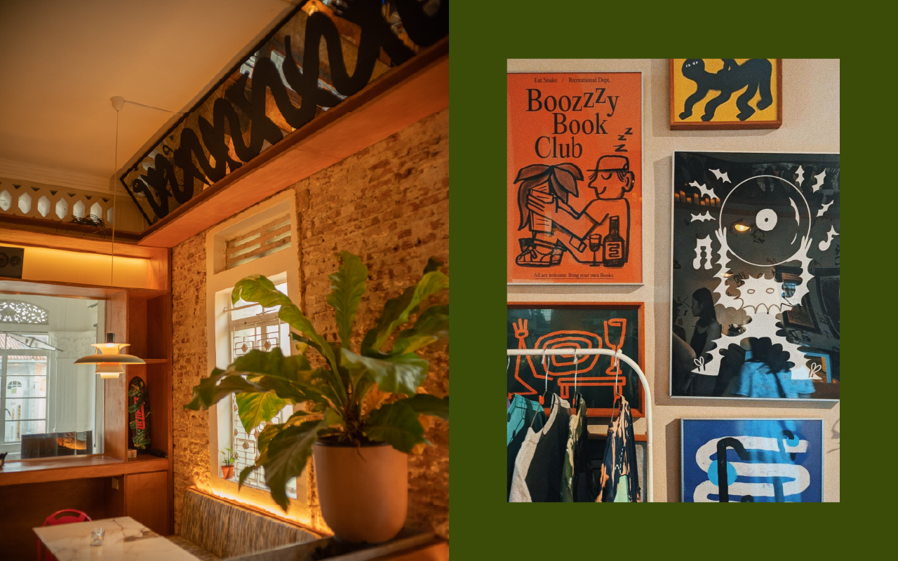
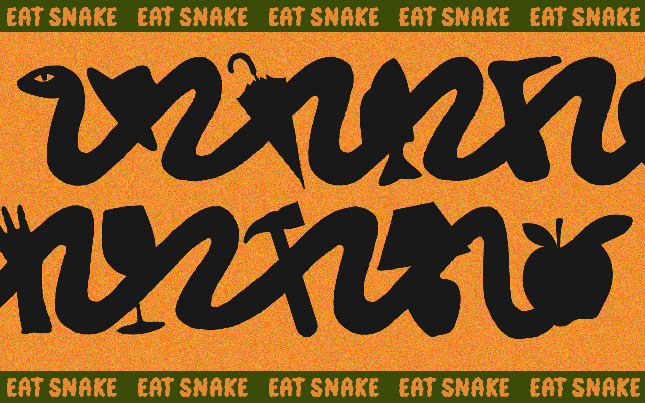
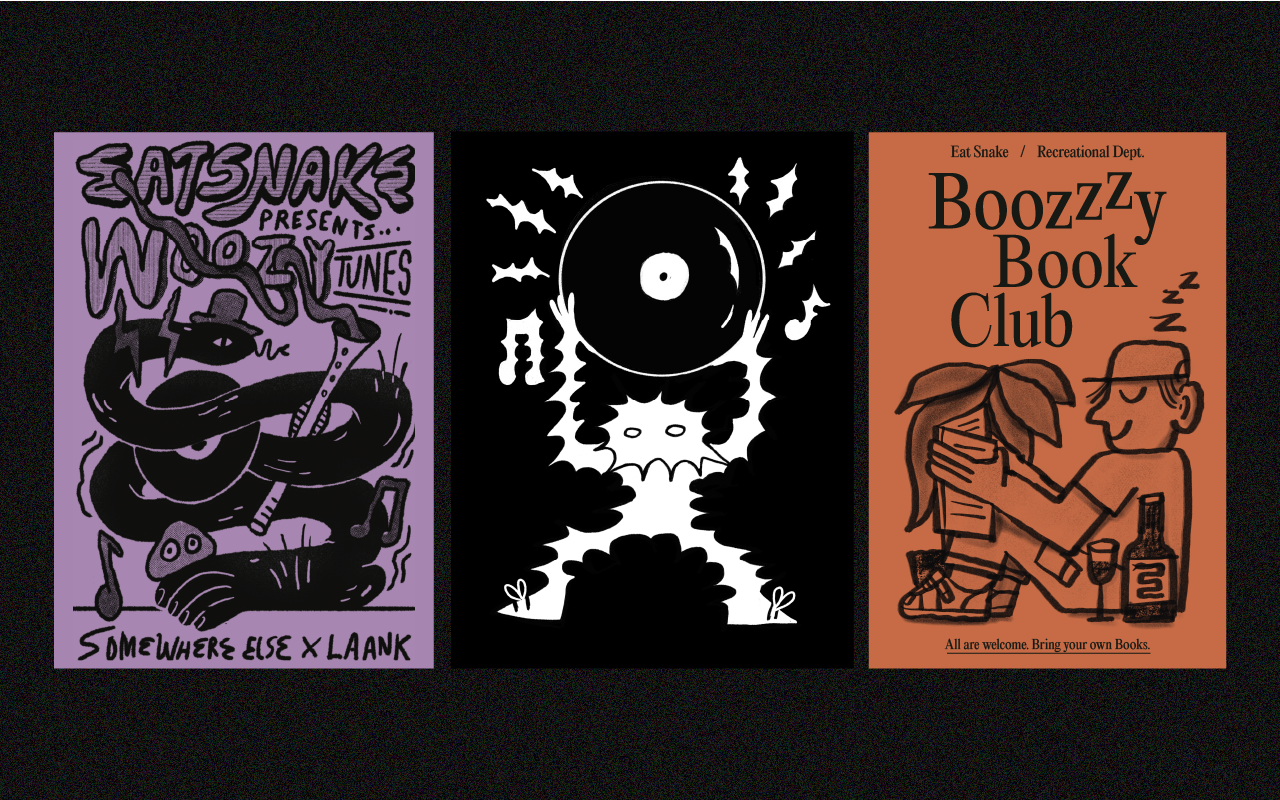
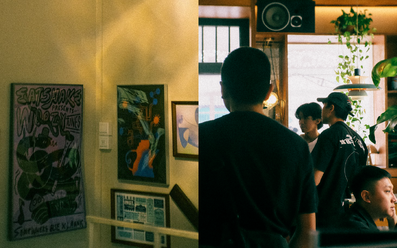
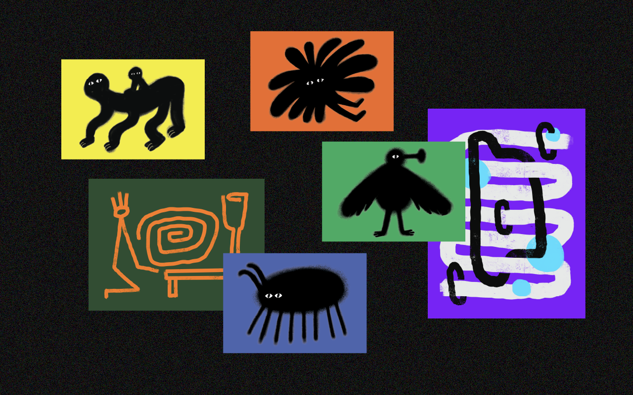
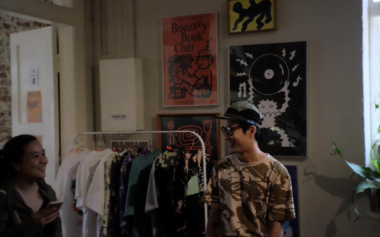
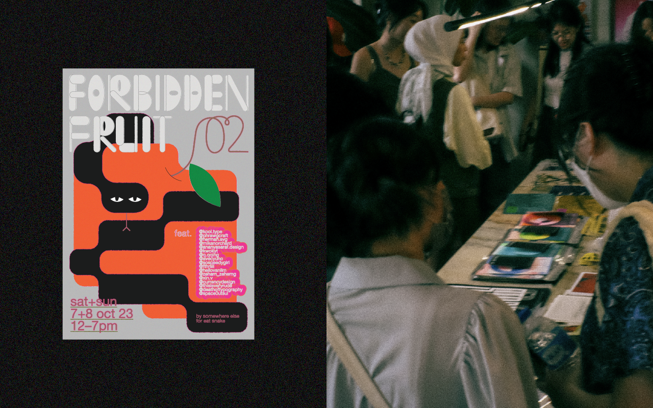
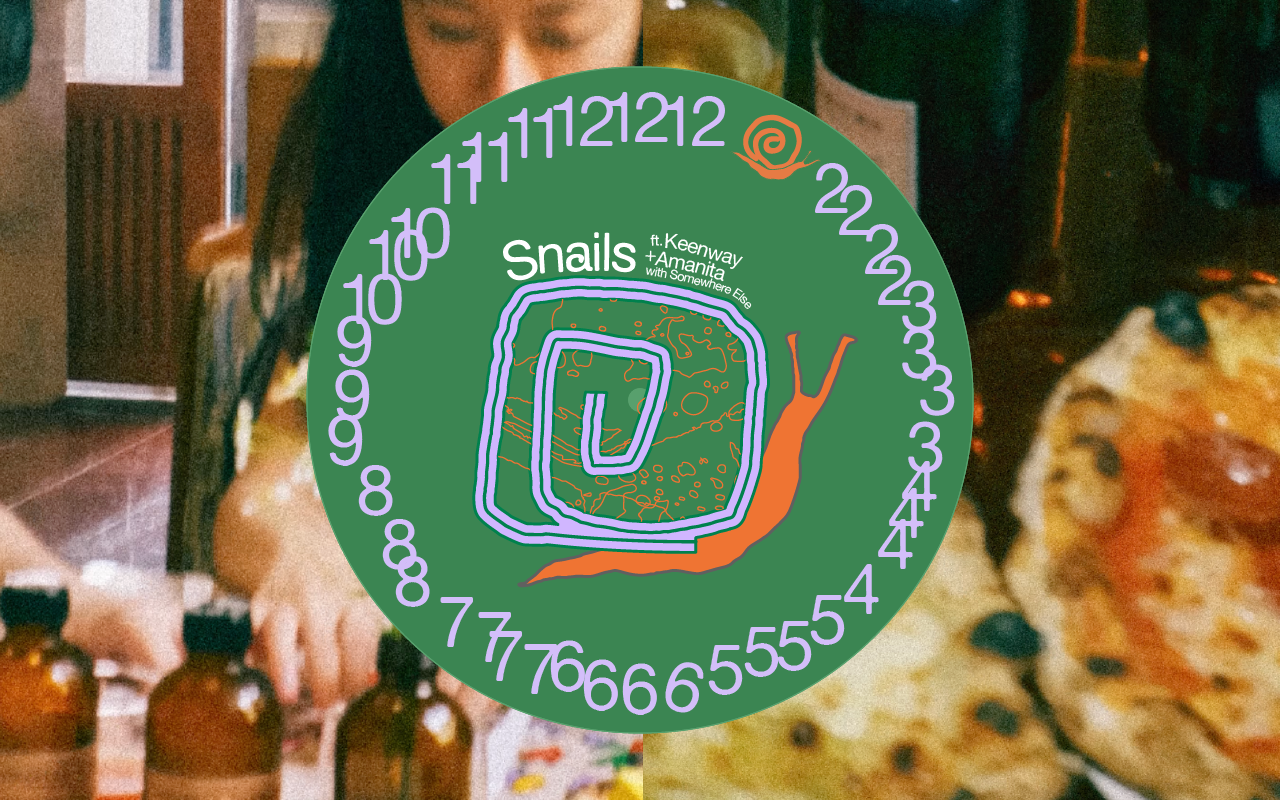
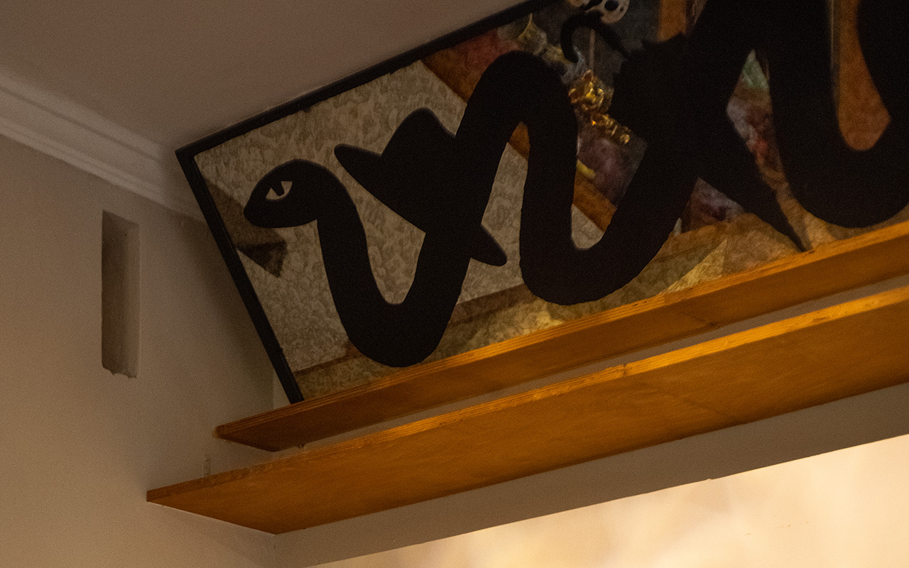
Occupying level 2 of a shophouse unit in Little India in Singapore, Eat Snake is a multi-functional space, accommodating a wide range of events, from lively music parties to engaging workshops, pop-up events and intimate private dining experiences.
When LAANK was working on the interior design, we worked with them to add some graphic accents in the form of posters, murals and mirrors, as well as created merch for the space.
I also worked on some event visuals like Forbidden Fruit, a creative market, as well as Snails, a slow community event.
TEAM
︎︎︎ Featured Graphics: Dan
︎︎︎ Additional Creatives (Not pictured): Soohee, Sabelle
︎︎︎ Interior Design: LAANK
︎︎︎ Project Director: Yong
︎︎︎ Completed at: Somewhere Else